|
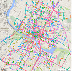
Previously, I plotted all the routes during a 24 hr span by Car2go customers in Austin. While it shows each individual route and its origin and destination, many of them were covered by the last plotted route if they share the same road. As a result, the plot does not show a lot of information (it is colorful though). Today, I modified the code a little bit to uncover the most popular road by Car2go customers. I dropped color = name in geom_path(), but grouped the routes by each car so that routes by different cars are not linked. I added alpha = 0.1 for transparency. This way, the road will show its popularity based on the color transparency, i.e. road with solid color is more popular than those with transparent color. 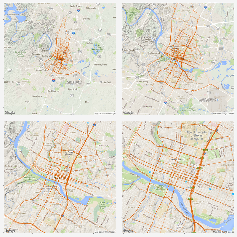 As we can see, MoPac Expy, Interstate 35, Hwy 290 and roads in downtown are most popular. Amongst downtown streets, east and west bound roads (number streets) are more popular than south and north bound roads, as interstate 35 and Lamar Blvd take majority of east-west traffic. Another reason might be that south and north bound roads are narrower and have more stop signs.
As why this color to represent the routes... Once again, all the codes are published here.
1 Comment
Identify moved carsFirst, we need to identify whether the car has moved or not. To do this, I removed duplicated rows based on location and only keep those whose location info has changed. Next, I get the rows represent the car first and last shown at that location (this is to get the time stamp of a trip: last shown at location is the start of a trip and first shown at another location if the end of a trip). Find and accurately plot the routeThen I use a for loop to loop through different cars (that have moved) and for each car, I loop through different trips (most likely, a car will have multiple trips). For each trip, I can get the route info from goole map api (library(ggmap) does it). It also gives the distance between each turn. The route info is an approximation to the actual movement of a car. Car2go doesn't supply realtime GPS info when the car is moving, it only records when a customer checks out a trip. However, I think the approximated route is close enough to a real life scenario, which assumes most car2go customers use the service for transportation purpose, other than leisure and recreation activities. 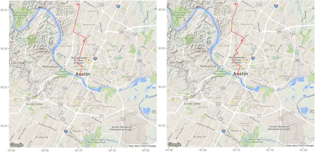 Left: route plotted from turn-by-turn instrctions. Right: same route plotted from detailed polyline from google map api. Left: route plotted from turn-by-turn instrctions. Right: same route plotted from detailed polyline from google map api. Then I was able to plot the route for each car using the route data return by google maps. The result is shown on the left below. While it roughly represents the route on the map, it fails for curvy roads with less turns. The reason is that route(output = 'simple') only gives instruction for each turn, and between each turn, geom_path uses a straight line. In order to solve this problem, I found this article, which converts polyline from goolge map api with route(output = 'all') and outputs (lon, lat) coordinates. Now the path represents the actual route on the road, as shown on the right plot above. All trips during a 24hr spanNext, I plot all the trips happened over Dec 07 13:40 - Dec 08 13:36 (Monday - Tuesday). The covered area is, as expected, similar to the service area of Car2go Austin. 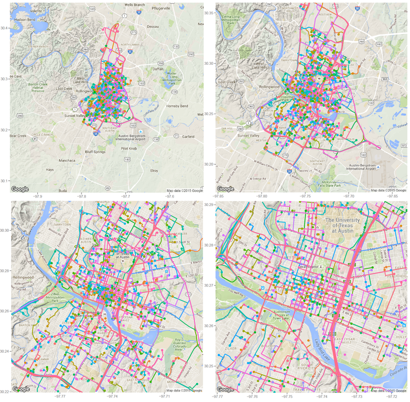 Car2go trips in Austin, TX in 24hrs Suprisingly, no trips took place in UT campus during this period (except very few in north campus). There could be several reasons: 1: limited parking space, 2: students are studying at home for final exams rather than taking classes, so there is significant less population, 2: Car2go is less popular than public transport for students. The actual reason is unknow from this set of data. More data (taken during normal semester time, during weekend when more parking is avalable, etc.) is needed. Update: I just found UT campus is a stop-over area only, therefore, it is not suprising at all. Trip statisticsNext let's take a look at trip statistics. 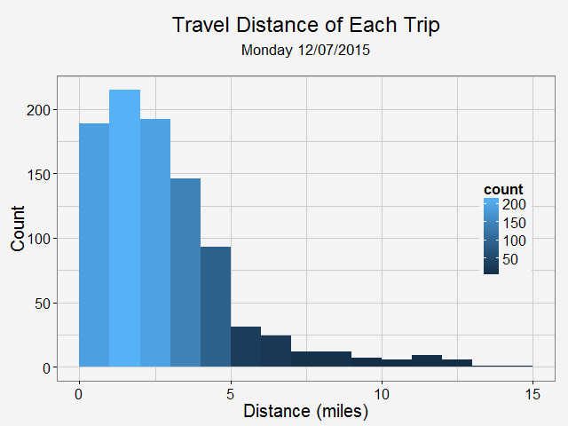 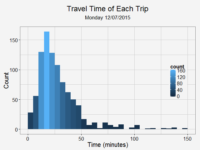 Most trips are less than 5 miles and 50 minutes. Note there are a significant amount of less than 1-mile trips. While some of them are actual trips by customers, the rest could be noise in the data or moveover by Car2go. Now, we can take a look at the starting time of a trip during a day. 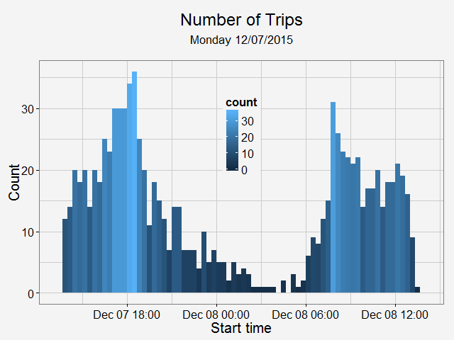 As shown in the above plot, most trips are for commute (~8am and ~6pm) and very few trips took place during midnight.
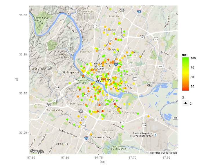 After I published an article on how to scrape advanced shooting data from stat.nba.com, a friend of mine contact me to see whether I may be able to scrape some data from zipcar or car2go’s API. So I looked into it and found it is quite straight forward to do. Here is an example to scrape data from car2go. Car2go is a popular car sharing program in North America and Europe. Here is a little introduction from Wiki if you haven’t about it: The company offers exclusively Smart Fortwo vehicles and features one-way point-to-point rentals. Users are charged by the minute, with hourly and daily rates available. As of May 2015, car2go is the largest carsharing company in the world with over 1,000,000 members. A typical URL looks like this. Anything after json is not needed. After putting it into R (using jsonlite), you will see a list of 1 data frame. However, the column coordinates need special attention as it is also a list. Therefore it is treated differently as other columns, and then they are then 'cbind'ed.  Also note cities with EVs have an attribute of 'charging' while others don't, in order to have a consistent sata structure, I first identify those cities based on length() of the data. Then incert a charging column into those that don't have and assign a value of NA. A for loop can be used to scrape data from different cities, an if statement will automatically identify which data processing code to use. Finally, all the data can be 'rbind'ed and output a csv. It is also quite easy to display all the cars on a map at a give time. Below is one example. I used the ggmap library. Color of each vehicle is to show how much fuel left. The result is the plot at the beginning of the blog. How about the average cleanness of cars in each city? or fuel level? 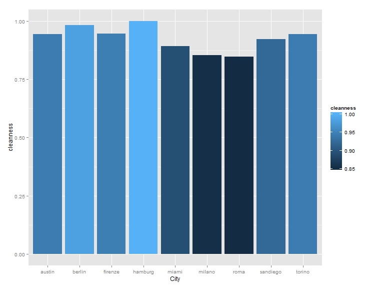 For limited sample size, it seems German cities have the highest car cleanness, Italian cites the lowest, while US cities are in the middle.
The entire code is published here if you are interested. Enjoy! |
AuthorA mechanical engineer who also loves data. Archives
January 2018
CategoriesBlogs I enjoy reading |
 RSS Feed
