|
Update: It appears to me that nba.com has removed the access to shot log data as of 02/10/2016. The scraped data is still available on my github. It is hard to convincingly evaluate a player's contribution to team offense, given so many factors involved, both objective and subjective. I took a shot at this problem by analyzing what kind of shot a player takes and how's that compared with league average. The result, as we shall see later, is quite inline with what we would expect. This is part I of the 2-part series. Part I mainly focuses on the analysis, while part II on building the Shiny app, with a potential part III for case studies. tl;dr: here is my final web app for this project. You can right click the plot and download it to create your own case study. Enjoy! Data used in the analysisI scraped each player's shot log from stat.nba.com for the last two seasons. The code for this task can be found in my previous post. The data consists of almost 300k shots in total and 400+ players each season. For each shot, it provides metrics like shot distance, shot clock, defender distance and the outcome of the shot etc. In this analysis, I will choose the two most important ones, shot distance and defender distance. They comprise an essential portion of a player's shot selection and have fundamental influence on the outcome of the shot. Analysis using RAfter the data is ready-tidy, the fun analysis begins with breaking down shot distance and defender distance. I divide shot distance into 8 catogories: 0-5 ft all the way up to 35+ with 5 ft interval and defender distance into 4: 0-2 ft up to 6+ with 2 ft interval. One for loop for different defender distance nested inside another for loop for shot distance. The following function takes a single data.frame argument in the shot log format and returns the FG%, total FGA, total FGM Pts and 2pt/total for each shot distance and defender distance. So depending on the input data.frame, we can get either the league average or the data for an individual player. I used chaining to simplify the code and it worked really well. I tried to use ddply(), it worked in the main script, however not inside a function due to some scoping bug. Code Editor
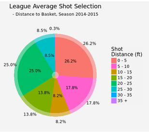
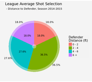
League averageOnce the function is constructed, we can first look at the league average shooting performance. This plot has two parts: the semi-transparent bar for league average and solid color for the player of interest, in this case league average as well (I kept both for consitensy with later plots for individual players). 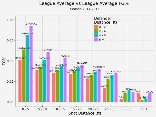 There is a clear trend that the closer to the basket, the better FG%. For the same range of shot distance, the farther the defender is, the better FG%. We've got a large enough sample size that we actually statistically proved it (except shot distance > 30 ft, where the sample size is limited)! As for shot selection, about quarter of the total shots are inside 5 ft or between 20-25 ft (this is a choice of compromise. NBA has a varying 3pts distance from 22 to 24 ft, so it is difficult to use shot distance for 2pt/3pt indication. However, about 75% of the shots between 20-25 ft are 3 pointers. So this range is a fairly good indicator for close 3 pointers). These two types shots are easy shots, or easy shots-with-good-return. 8.5% are long 3 pointers and less than 1% total for desperation shots (30-35 ft and 35+ ft). On the other hand, 46% of the shots are open (and 18% are wide open). Another 18% are closely contested while 37% are within normal defender distance 2-4 ft. By displaying an individual player's shot selection, we can see whether this player likes 3 pointers, prefers open shots and etc.
Speaking of season to season variation, there is very little difference between the last two seasons (although this seanson I only gathered about 1/3 of the shots as last season). You can take a look by yourself. Player value added to team offenseNow let me try to answer the question I posted at the beginning of this article. The way I look at it is that I trust a player's shot selection under circumstances on the court (after all, too many bad shots would get you benched). However, the player should be responsible for the shot choice he took: if he ouperformes league average on a contested long 3, he has added positive value to team offense. If the player misses a wide open lay up, he has added a much negative value because wide open lay ups have very high points expectation. With that in mind, here is my take on player value: 1, obtain the league average FG% (as in previous section) 2, for each player, calculate the expected Pts (equals FGA * average FG%) and actual Pts scored at each location each defender distance 3, take the difference between these two, the more positive the difference is, the more value that player added to team offense from a scoring point of view. 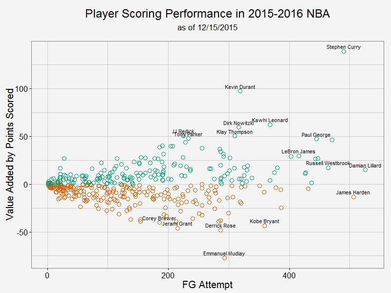 As we can see from this plot, Curry has added the most value to his team while also taken a tremendous amount of shots. In fact, he added almost 5 points per game to Warriors' offense. KD takes less shots, but he is actually more efficient than Curry per shot attempt. Damian Lillard and James Harden take most shots in this season and they are about average. In this analysis, I didn't take free throws into account. As a result, players like James Harden are under-appreciated.
For those who have negative impact to their team, we see Mudiay and Rose leading the way. If you take a look their FG% break down, it is mostly because they couldn't finish contested shots in the paint and open 3 pointers. Notably, Kobe is also in the bottom 5. All right, there you have it. I will put another article on how to construct the shiny app during this holiday season. Until then, have fun comparing your favourite player with the rest!
0 Comments
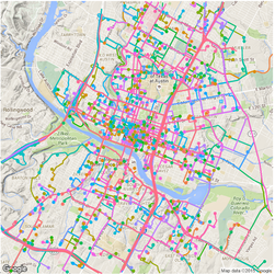
Previously, I plotted all the routes during a 24 hr span by Car2go customers in Austin. While it shows each individual route and its origin and destination, many of them were covered by the last plotted route if they share the same road. As a result, the plot does not show a lot of information (it is colorful though). Today, I modified the code a little bit to uncover the most popular road by Car2go customers. I dropped color = name in geom_path(), but grouped the routes by each car so that routes by different cars are not linked. I added alpha = 0.1 for transparency. This way, the road will show its popularity based on the color transparency, i.e. road with solid color is more popular than those with transparent color. 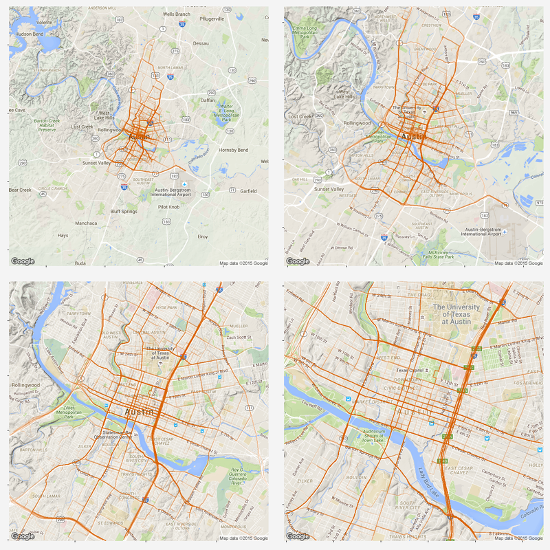 As we can see, MoPac Expy, Interstate 35, Hwy 290 and roads in downtown are most popular. Amongst downtown streets, east and west bound roads (number streets) are more popular than south and north bound roads, as interstate 35 and Lamar Blvd take majority of east-west traffic. Another reason might be that south and north bound roads are narrower and have more stop signs.
As why this color to represent the routes... Once again, all the codes are published here. Comparing total QBR with Passer Rating-Who are the most underrated and overrated passer in NFL12/11/2015 Total Quarterback Rating (Total QBR) is a measure for QB performance created by ESPN in 2011. It was intended to overcome obivous drawbacks of passer rating, which is purely based on passing stats. Total QBR evaluates each play and assigns a value according to many factors (like outcome of the play) including subjective ones, such as how clutch the throw was, how much pressure the passer was under, etc. Passer rating is much simpler, it only measures the 'hard stats': passing yards, TDs, etc. Which rating system is more representative of QB performance is debatable. While total QBR has received a lot of critics (partly because ESPN has not released the model), it is arguably a more valuable measure of the value of a QB (after all, a WR who catches a ball travelling 5 yards in the air and runs 80 yards for a TD should receive more credit than the QB). So the question is how are these two compared with each, and what might be the takeaway from this comparison. Scrape data from ESPN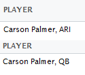 PLAYER columns have different values for same player PLAYER columns have different values for same player The data on ESPN website is different from stat.nba.com or Car2go, which I worked on previously. They are stored on the server and can be extracted rather easily using readHTMLTable(). Note player name values are different in each table. Therefore I made a short string and merge() the two tables into one with by = 'playerShort'. Total QBR vs passer ratingThe data is rbinded to include years from 2006 -2015. Below is a gif loop over the comparison plot for each year. The overall trend is expected: total QBR and passer rating are positively correlated. I plotted the linear regression and 95% confidence interval as well. If we make the prediction of QBR from passer rating based on this curve, this is not too far off. Of course ESPN has more advance stats as input data to find a better regression (basically the QBR model), but passer rating is also robust and much simpler. It is essential for a model to be easy to understand, even sometimes, this means a little accuracy is sacraficed (again, this is debatable here). Without realeasing the actual model makes QBR hard to explain to someone, not to mention the subjective metrics: how clutch is clutch... 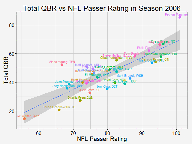 The underrated and overratedNever the less, let's say the 'clutchness' of the world really makes a positive impact to player evaluation and since passer rating fails to capture it, we can make a judgement whether a player is under- or overrated. For example: Ryan Tannehill's passer rating this season is 88.3, which is about average. However, his QBR is only 34 ( voice of Skip Bayless: over the scale of 0 to 100), which is pretty bad. As a result, he is overrated as an average passer. On the flip side, Andrew Luck's passer rating in his rookie season was 76.5, about 10 points below average, but his QBR is 67.4, way above average. So in his rookie season, Andrew Luck was underrated as a below-average passer. In fact, he was very clutch. Next, I plot the top 15 most under- and overrated passers in the past decade. The criterion is the residuals() of the aforementioned regression in each year (QBR may only be compared in single season). This is a very interesting plot, especially when you are very familiar with NFL QB stats and performance in the last decade. For me, I only became a fan since recent years, so bear with me. 1: As good as we think Peyton Manning was from 06-10, he's not getting enough credit 2: Ryan Tannehill is really bad this season, like much-worse-than-we-thought bad. 3: Kevin Kolb was even worse back in 2011 in Arizona. 4: Philip Rivers posted best passer rating in 2008 with 105.5, but he was not as good as many other QBs that year in terms of value added to the team (Charges won AFC west with 8-8 record.) 5: Jay Cutler appeared twice on the underrated passer list, the latest was 2013 season, after which he signed a seven-year deal with the Bears 6: Ryan Fitzpatrick is clutch this year! Enough said. 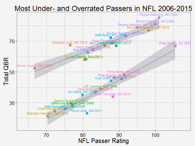 Over the last decade, the average passer rating has increased from 80 to over 90. No doubt NFL is becoming a passing friendly league (We can look at other metrics like increasing QB salary/cap, and the flip side of RB, penalties called to protect QB, average play per game and etc., but this is another article ). Average QBR shoule be 50 (per definition?), but here I am only presenting the QBR averaged over player (I guess more accurately, I should average over per play, but I don't have the data). 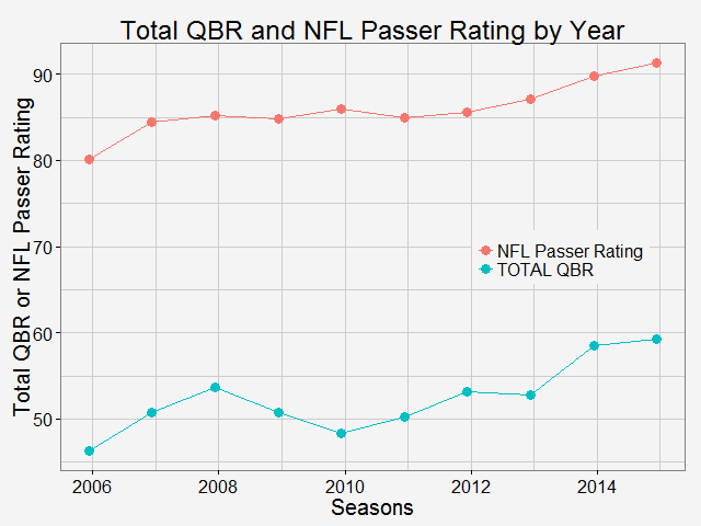 The entire code is published here. I partly used Mr. Todd W. Schneider's theme for my plots.
Identify moved carsFirst, we need to identify whether the car has moved or not. To do this, I removed duplicated rows based on location and only keep those whose location info has changed. Next, I get the rows represent the car first and last shown at that location (this is to get the time stamp of a trip: last shown at location is the start of a trip and first shown at another location if the end of a trip). Find and accurately plot the routeThen I use a for loop to loop through different cars (that have moved) and for each car, I loop through different trips (most likely, a car will have multiple trips). For each trip, I can get the route info from goole map api (library(ggmap) does it). It also gives the distance between each turn. The route info is an approximation to the actual movement of a car. Car2go doesn't supply realtime GPS info when the car is moving, it only records when a customer checks out a trip. However, I think the approximated route is close enough to a real life scenario, which assumes most car2go customers use the service for transportation purpose, other than leisure and recreation activities. 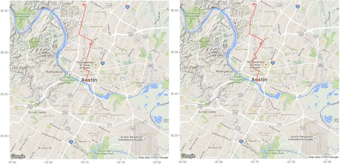 Left: route plotted from turn-by-turn instrctions. Right: same route plotted from detailed polyline from google map api. Left: route plotted from turn-by-turn instrctions. Right: same route plotted from detailed polyline from google map api. Then I was able to plot the route for each car using the route data return by google maps. The result is shown on the left below. While it roughly represents the route on the map, it fails for curvy roads with less turns. The reason is that route(output = 'simple') only gives instruction for each turn, and between each turn, geom_path uses a straight line. In order to solve this problem, I found this article, which converts polyline from goolge map api with route(output = 'all') and outputs (lon, lat) coordinates. Now the path represents the actual route on the road, as shown on the right plot above. All trips during a 24hr spanNext, I plot all the trips happened over Dec 07 13:40 - Dec 08 13:36 (Monday - Tuesday). The covered area is, as expected, similar to the service area of Car2go Austin. 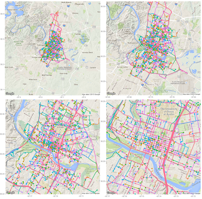 Car2go trips in Austin, TX in 24hrs Suprisingly, no trips took place in UT campus during this period (except very few in north campus). There could be several reasons: 1: limited parking space, 2: students are studying at home for final exams rather than taking classes, so there is significant less population, 2: Car2go is less popular than public transport for students. The actual reason is unknow from this set of data. More data (taken during normal semester time, during weekend when more parking is avalable, etc.) is needed. Update: I just found UT campus is a stop-over area only, therefore, it is not suprising at all. Trip statisticsNext let's take a look at trip statistics. 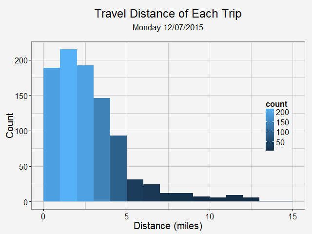 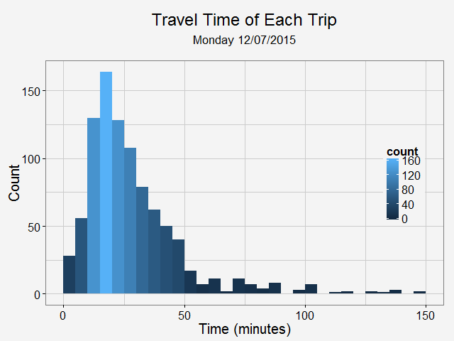 Most trips are less than 5 miles and 50 minutes. Note there are a significant amount of less than 1-mile trips. While some of them are actual trips by customers, the rest could be noise in the data or moveover by Car2go. Now, we can take a look at the starting time of a trip during a day. 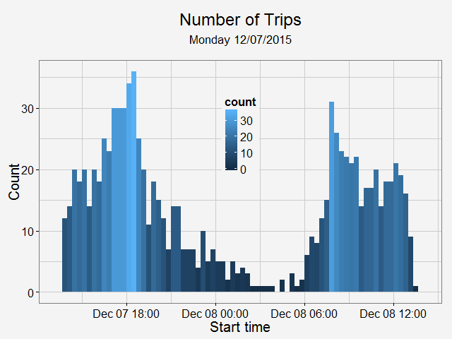 As shown in the above plot, most trips are for commute (~8am and ~6pm) and very few trips took place during midnight.
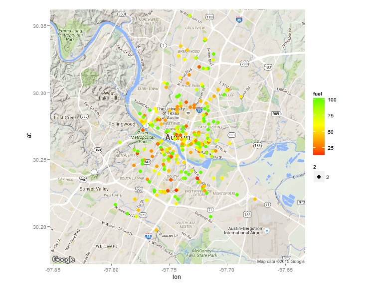 After I published an article on how to scrape advanced shooting data from stat.nba.com, a friend of mine contact me to see whether I may be able to scrape some data from zipcar or car2go’s API. So I looked into it and found it is quite straight forward to do. Here is an example to scrape data from car2go. Car2go is a popular car sharing program in North America and Europe. Here is a little introduction from Wiki if you haven’t about it: The company offers exclusively Smart Fortwo vehicles and features one-way point-to-point rentals. Users are charged by the minute, with hourly and daily rates available. As of May 2015, car2go is the largest carsharing company in the world with over 1,000,000 members. A typical URL looks like this. Anything after json is not needed. After putting it into R (using jsonlite), you will see a list of 1 data frame. However, the column coordinates need special attention as it is also a list. Therefore it is treated differently as other columns, and then they are then 'cbind'ed.  Also note cities with EVs have an attribute of 'charging' while others don't, in order to have a consistent sata structure, I first identify those cities based on length() of the data. Then incert a charging column into those that don't have and assign a value of NA. A for loop can be used to scrape data from different cities, an if statement will automatically identify which data processing code to use. Finally, all the data can be 'rbind'ed and output a csv. It is also quite easy to display all the cars on a map at a give time. Below is one example. I used the ggmap library. Color of each vehicle is to show how much fuel left. The result is the plot at the beginning of the blog. How about the average cleanness of cars in each city? or fuel level? 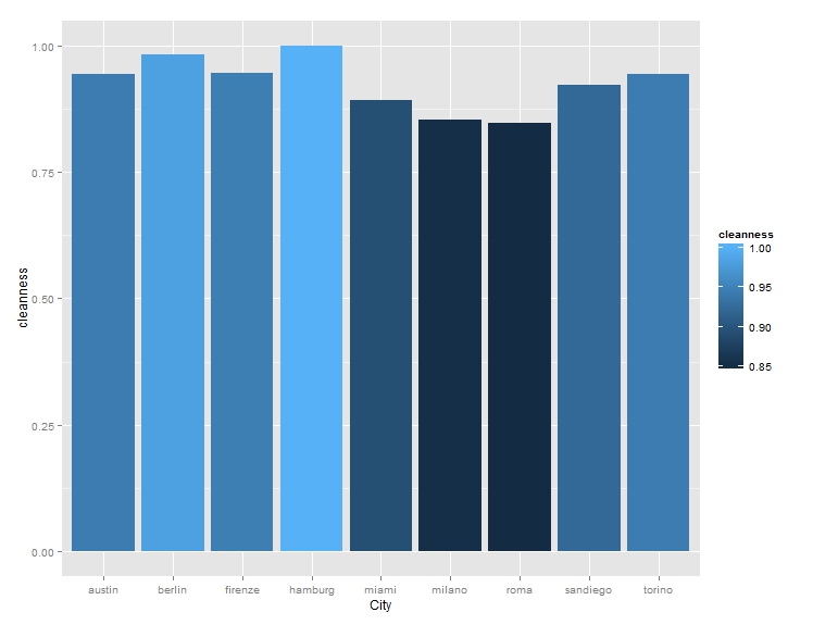 For limited sample size, it seems German cities have the highest car cleanness, Italian cites the lowest, while US cities are in the middle.
The entire code is published here if you are interested. Enjoy! Update: It appears to me that nba.com has removed the access to shot log data as of 02/10/2016. Ever since NBA introduced advanced data to track player on-court movement, there have been a lot of interesting blogs/news articles to show how data could improve the understanding (or destroy your intuition) of the game. Reading them is a lot of fun. Here is one example. The newly introduce metric called KOBE measures how difficult a shot is. A more recent article on http://fivethirtyeight.com/ praises a player to new high using data science (which is arguably more convincing at the first glance). A simple logistic regression is used to predict an outcome (made or not) of a shot based on the shot distance, shot clock remaining and distance to closest defender. Whether the correlation is strong enough to give a reliable prediction is not given. However, the result is somewhat people who have followed NBA would expect. Curry, amongst Durant, Korver and DeAndre Jordan, is the most efficient shooter in NBA. While the regression is quite easy to formulate, getting and cleaning the data is not so straightforward. None of the articles I found online (including the above) gives a direct link to the data, or even the details how to get them from nba.com. Interested in doing some interesting analysis myself, I decided to make such a data frame. Finding the correct url could be a little tricky, as you really need to dig into the website. Here is one very useful resource about how to scrape data from a website. Here I get a list of player ID and the corresponding names. Data from 2014-2015 is collected from each player in that list and then combined into a single cvs file. The code is published here. And if you don't want to run the script but just want to play with the data, I included the cvs file as well. The file size is about 30 MB and has more than 200,000 shot attemps. Enjoy! 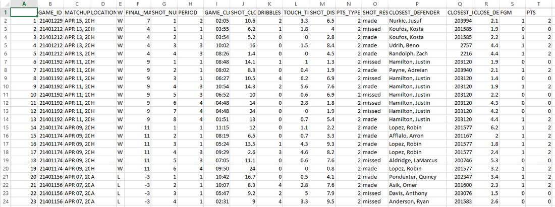 |
AuthorA mechanical engineer who also loves data. Archives
January 2018
CategoriesBlogs I enjoy reading |
 RSS Feed
