|
Update: using Manhattan distance in k-means
Note the capital 'K' in Kmeans function from the amap package. 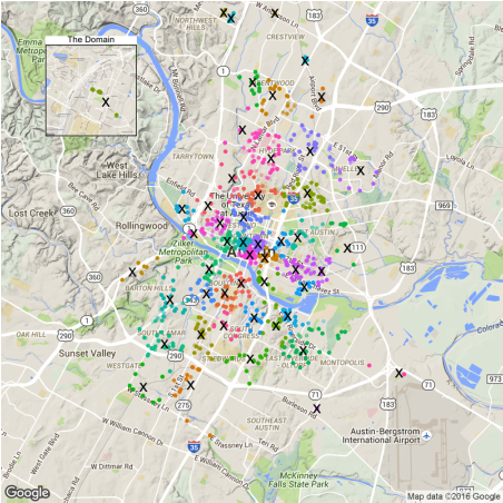
Using 'Manhattan distance' puts more weight to sparsely distributed locations. As a result, we can see more proposed EV locations in remote areas and less in downtown.
Code is published on my github.
Previously, I did some analysis on car2go's location data to find the most popular roads in Austin. But we can do much more. One question I have is: if car2go wants to replace the entire Austin fleet with electric vehicles, where should the charging stations be? Can we use the existing public charging stations? How many more shall we build and where? In this article, I will try to answer them using the data I scraped. If ever one day car2go decides to do so, it should be a more thorough analysis than this one, especially in business domain. However, this could be a good starting point.
Fun fact: Car2go has the only all-EV fleet in San Diego in the whole US. Location data
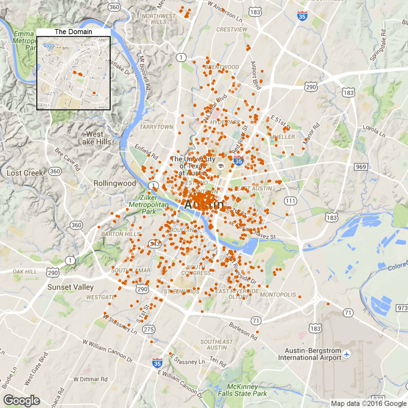
I'll use the locationI scraped last month. A car will have multiple entries because it is not constantly moving. Those duplicated entries seem redundant at first. However, since charging an EV takes substantially more time than filling the tank, a car staying at one place for a prolonged time makes this place more suitable for a charging station. Therefore, these entries puts more weight in my algorithm later on.
First, let's see those locations. library(ggmap) library(grid) library(dplyr) library(ggplot2) library(broom) time.df <- read.csv('data/1Timedcar2go_week.csv', header = T) #car location plot p1<- ggmap(get_map(location = 'austin', zoom = 12), extent = 'device')+ geom_point(aes(x = Longitude, y = Latitude), data = time.df, alpha = 0.1, color = '#D55E00', size = 4) + theme(legend.position = 'none') p1.2<- ggmap(get_map('domain, austin', zoom = 15), extent = 'device')+ geom_point(aes(x = Longitude, y = Latitude), data = time.df, alpha = 0.1, color = '#D55E00', size = 4) + ggtitle('The Domain')+ theme(legend.position = 'none', plot.title = element_text(size = rel(2)), panel.border = element_rect(colour = "black", fill = NA, size=2)) plot_inset <- function(name, p1, p2){ png(name, width=1280, height=1280) grid.newpage() v1<-viewport(width = 1, height = 1, x = 0.5, y = 0.5) #plot area for the main map v2<-viewport(width = 0.2, height = 0.2, x = 0.18, y = 0.83) #plot area for the inset map print(p1,vp=v1) print(p2,vp=v2) dev.off() } plot_inset('1.png', p1, p1.2)
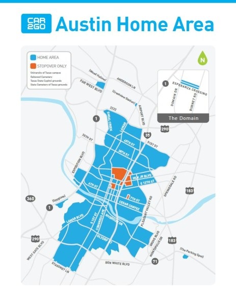
Note those remote home areas: the domain, far west and the parking spot near airport.
Finding optimal location for charging stations
To locate optimal charging stations, we need to minimize the distance that car2go staff have to move the car from where it is returned to the station. One method immediately coming to mind is K-means. It does exactly what we need to find those locations (or centroids). So the next question is: how many charging stations? Can we use the data to determine the number? Let's plot the within-group sum of square.
set.seed(18) wss <- data.frame(clusterNo = seq(1,50), wss = rep(0, 50)) for (i in 1:50){ clust.k <-time.df %>% select(Longitude, Latitude) %>% kmeans(i, iter.max=500) wss$wss[i] <- clust.k$tot.withinss } p2 <- ggplot(wss)+geom_point(aes(clusterNo, wss), size = 4, shape = 1, color='#009E73')+ xlab('No. of Centroids') + ylab('WSS') + theme_bw(18) png('2.png', width=640, height=480) print(p2) dev.off() 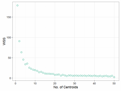
So it seems after 10, the overall WSS reduction is not significant wrt increasing no. of centroids. But is this the optimal number? It seems too few. We have to consider more aspects: cost of a new charging station, cost of moving the vehicles per unit distance, max range of a car, or even towing expence. All these requires more data and a business mind. For the sake of this article, I will assume building a charging station is relatively cheap and top priority is customer convenience. So let's take 50 charging stations.
#50 charging station clust <- time.df %>% select(Longitude, Latitude) %>% kmeans(50, iter.max=500) p3<- ggmap(get_map(location = 'austin', zoom = 12), extent = 'device')+ geom_point(data=augment(clust, time.df), aes(x = Longitude, y = Latitude, color = .cluster), alpha =0.1, size = 4) + geom_point(aes(Longitude, Latitude), data = data.frame(clust$centers), size = 15, shape = 'x') + theme(legend.position = 'none') p3.2<- ggmap(get_map('domain, austin', zoom = 15), extent = 'device')+ geom_point(data=augment(clust, time.df), aes(x = Longitude, y = Latitude, color = .cluster), alpha =0.1, size = 4) + geom_point(aes(Longitude, Latitude), data = data.frame(clust$centers), size = 15, shape = 'x') + ggtitle('The Domain')+ theme(legend.position = 'none', plot.title = element_text(size = rel(2)), panel.border = element_rect(colour = "black", fill = NA, size=2)) plot_inset('3.png', p3, p3.2) 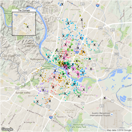
So the crosses in the figure are proposed charging stations. The algorithm suggests we deploy the station at each of those remote home areas: the domain, far west and the parking spot near airport. More stations should be deployed in downtown as expected.
Using existing public charging stations
For those locations, can we use existing charging stations in Ausin? I downloaded ev station data from here: http://www.afdc.energy.gov/data_download/. Now let's plot proposed (X) and existing stations (E) together.
station.df <- read.csv('data/charging_stations (Feb 20 2016).csv', header = T) station.austin = station.df%>%dplyr::filter(City=='Austin') p4<- ggmap(get_map(location = 'austin', zoom = 12), extent = 'device')+ geom_point(aes(Longitude, Latitude), data = data.frame(clust$centers), size = 15, shape = 'x') + geom_point(aes(x = Longitude, y = Latitude), data = station.austin, size = 14, shape = 'E', color = '#009E73') + theme(legend.position = 'none') p4.2<- ggmap(get_map('domain, austin', zoom = 15), extent = 'device')+ geom_point(aes(Longitude, Latitude), data = data.frame(clust$centers), size = 15, shape = 'x') + geom_point(aes(x = Longitude, y = Latitude), data = station.austin, size = 14, shape = 'E', color = '#009E73') + ggtitle('The Domain')+ theme(legend.position = 'none', plot.title = element_text(size = rel(2)), panel.border = element_rect(colour = "black", fill = NA, size=2)) plot_inset('4.png', p4, p4.2) 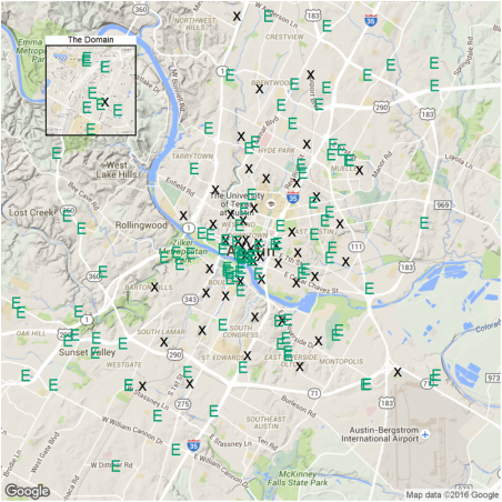
Again, downtown is well covered. But residential areas like Barton hills and South Lamar are not. The reason is that public EV stations are often built in places of interest (e.g. malls) while car2go parking rules require the cars to park on street meters. If I have to park at a mall, I need to pay the entire duration. So given this fact, it is not suprising that additional charging stations are needed.
The criteria for a new station is that no existing station is within 0.5 miles of the proposed station. station.dist <- mutate(data.frame(clust$centers), distToExist= 0) for (i in 1:nrow(station.dist)){ # In the area of Austin, one dgree in Latitude is 69.1 miles, # while one degree in Longitude is 59.7 miles d <- sqrt(((station.austin$Latitude-station.dist$Latitude[i])*69.1)**2 +((station.austin$Longitude-station.dist$Longitude[i])*59.7)**2) station.dist$distToExist[i] <- min(d) } p5 <-ggmap(get_map(location = 'austin', zoom = 12), extent = 'device')+ geom_point(aes(Longitude, Latitude, color = -sign(distToExist-0.5)), data = station.dist, size = 15, shape = 'x') + geom_point(aes(x = Longitude, y = Latitude), data = station.austin, size = 14, shape = 'E', color = '#009E73') + theme(legend.position = 'none') p5.2<- ggmap(get_map('domain, austin', zoom = 15), extent = 'device')+ geom_point(aes(Longitude, Latitude, color = -sign(distToExist-0.5)), data = station.dist, size = 15, shape = 'x') + geom_point(aes(x = Longitude, y = Latitude), data = station.austin, size = 14, shape = 'E', color = '#009E73') + ggtitle('The Domain')+ theme(legend.position = 'none', plot.title = element_text(size = rel(2)), panel.border = element_rect(colour = "black", fill = NA, size=2)) plot_inset('5.png', p5, p5.2) 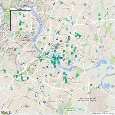
The light-blue crosses represent a station very close to existing ones and dark-blue crosses are new one to be built. There are 14 in total.
Conclusion
OK there you have it. I just used the k-means method to propose new charging stations if car2to decides to deploy an all-EV fleet in Austin. There are 14 locations that require new charging stations. Most of these locations are residential areas far from downtown, where the EV infastructure is lacking.
Back to R script, k-means is really easy to implement. The harder part is to connect the data with business insights.
4 Comments
IntroductionIn my last post, we walked through the construction of a two-layer neural network and used it to classify the MNIST dataset. Today, I will show how we can build a logistic regression model from scratch (spoiler: it’s much simpler than a neural network). Linear and logistic regression are probably the simplest yet useful models in a lot of fields. They are fast to implement and also easy to interpret. In this post, I will first talk about the basics of logistic regression, followed by model construction and training on my NBA shot log dataset, then I will try to interpret the model through statistical inference. Finally, I will compare it with the built-in Logistic regressionLogistic regression is a generalized linear model, with a binominal distribution and logit link function. The outcome \(Y\) is either 1 or 0. What we are interested in is the expected values of \(Y\), \(E(Y)\). In this case, they can also be thought as probability of getting 1, \(p\). However, because \(p\) is bounded between 0 and 1, it’s hard to implement the method similar to what we did for linear regression. So instead of predicting \(p\) directly, we predict the log of odds (logit), which takes values from \(-\infty\) to \(\infty\). Now the function is: \(\log(\frac{p}{1-p})=\theta_0 + \theta_1x_1 + \theta_2x_2 + ...\), let’s denote the RHS as \(x\cdot\theta\). Next the task is to find \(\theta\). In logistic regresion, the cost function is defined as: \(J=-\frac{1}{m}\sum_{i=1}^m(y^{(i)}\log(h(x^{(i)}))+(1-y^{(i)})\log(1-h(x^{(i)})))\), where \(h(x)=\frac{1}{1+e^{-x\cdot\theta}}\) is the sigmoid function, inverse of logit function. We can use gradient descent to find the optimal \(\theta\) that minimizes \(J\). So this is basically the process to construct the model. It is actually simpler than you think when you starting coding. Model construction in RNow let’s build our logistic regression. First I will define some useful functions. Note
Here comes the logistic regression fuction, which takes training dataframe X, and label y as function input. It returns a column vector which stores the coefficients in theta. One thing to pay attention to is that the input X usually doesn’t have a bias term, the leading column vector of 1, so I added this column in the function.
Training with NBA shot log datasetNow let’s train our model with the NBA shot log dataset. Specifically, I am interested in how will shot clock, shot distance and defender distance affect shooting performance. Naively, we would think more time remaining in shot clock, shorter distance to basket, farther to defender will all increase the probability of a field goal. Shortly, we will see whether we can statistically prove that.
How do we interpret the model?
Now, look at the signs of the coefficients, we can conclude that increase in SHOT_CLOCK, CLOSE_DEF_DIST and decrease in SHOT_DIST will all have positive impact in FG%. Next, let’s compare our self-built model with the
We did a pretty good job as the coefficient are almost identical to 3rd decimal place. Prediction function and the Expected FG%Finally, I will write a prediction function that will output the probability of getting 1 in a logistic regression.
Generate a new data grid to see how FG% changes with predictors.
Visulize the impactShot clock seems to have the least impact, so I will exclude that in this plot.
Indeed, wide open shots in the paint have the highest probability and contested long 3s have the lowest. This plot conveys very similar information as the one I did in my shiny app. However, doing regression smoothens things out (regression to mean?) and losses some important features. For example, the predictions of extreme cases (shot distance < 5ft or > 35ft) are all less drastic than what the reality is. Adding higher order terms will be a way to improve.
ConclusionThere you have it, it is not that hard for ourselves to build a regression model from scratch (as we also demonstrated in neural network). If you follow this post, hopefully by now, you have a better understanding of logistic regression. One last note, although logistic regression is often said to be a classifier, it can also be used for regression (to find the probability). Introduction
Image classification is one important field in Computer Vision, not only because so many applications are associated with it, but also a lot of Computer Vision problems can be effectively reduced to image classification. The state of art tool in image classification is Convolutional Neural Network (CNN). In this article, I am going to write a simple Neural Network with 2 layers (fully connected). First, I will train it to classify a set of 4-class 2D data and visualize the decision boundary. Second, I am going to train my NN with the famous MNIST data (you can download it here: https://www.kaggle.com/c/digit-recognizer/download/train.csv) and see its performance. The first part is inspired by CS 231n course offered by Stanford: http://cs231n.github.io/, which is taught in Python.
Data set generation
First, let’s create a spiral dataset with 4 classes and 200 examples each.
library(ggplot2)
library(caret)

N <- 200 # number of points per class
D <- 2 # dimensionality
K <- 4 # number of classes
X <- data.frame() # data matrix (each row = single example)
y <- data.frame() # class labels

set.seed(308)

for (j in (1:K)){
  r <- seq(0.05,1,length.out = N) # radius
  t <- seq((j-1)*4.7,j*4.7, length.out = N) + rnorm(N, sd = 0.3) # theta
  Xtemp <- data.frame(x =r*sin(t) , y = r*cos(t))
  ytemp <- data.frame(matrix(j, N, 1))
  X <- rbind(X, Xtemp)
  y <- rbind(y, ytemp)
}

data <- cbind(X,y)
colnames(data) <- c(colnames(X), 'label')
X, y are 800 by 2 and 800 by 1 data frames respectively, and they are created in a way such that a linear classifier cannot separate them. Since the data is 2D, we can easily visualize it on a plot. They are roughly evenly spaced and indeed a line is not a good decision boundary.
x_min <- min(X[,1])-0.2; x_max <- max(X[,1])+0.2 y_min <- min(X[,2])-0.2; y_max <- max(X[,2])+0.2 # lets visualize the data: ggplot(data) + geom_point(aes(x=x, y=y, color = as.character(label)), size = 2) + theme_bw(base_size = 15) + xlim(x_min, x_max) + ylim(y_min, y_max) + ggtitle('Spiral Data Visulization') + coord_fixed(ratio = 0.8) + theme(axis.ticks=element_blank(), panel.grid.major = element_blank(), panel.grid.minor = element_blank(), axis.text=element_blank(), axis.title=element_blank(), legend.position = 'none') 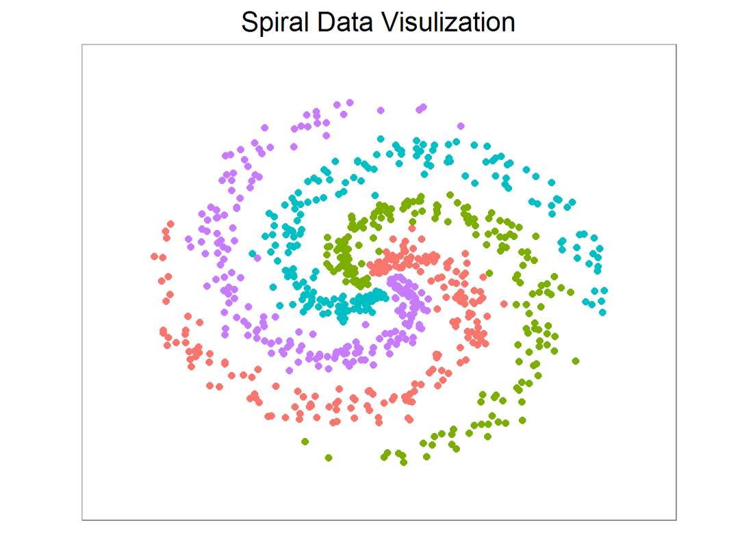
Neural network construction
Now, let’s construct a NN with 2 layers. But before that, we need to convert X into a matrix (for matrix operation later on). For labels in y, a new matrix Y (800 by 4) is created such that for each example (each row in Y), the entry with index==label is 1 (and 0 otherwise).
Next, let’s build a function ‘nnet’ that takes two matrices X and Y and returns a list of 4 with W, b and W2, b2 (weight and bias for each layer). I can specify step_size (learning rate) and regularization strength (reg, sometimes symbolized as lambda).
For the choice of activation and loss (cost) function, ReLU and softmax are selected respectively. If you have taken the ML class by Andrew Ng (strongly recommended), sigmoid and logistic cost function are chosen in the course notes and assignment. They look slightly different, but can be implemented fairly easily just by modifying the following code. Also note that the implementation below uses vectorized operation that may seem hard to follow. If so, you can write down dimensions of each matrix and check multiplications and so on. By doing so, you also know what’s under the hood for a neural network. # %*% dot product, * element wise product nnet <- function(X, Y, step_size = 0.5, reg = 0.001, h = 10, niteration){ # get dim of input N <- nrow(X) # number of examples K <- ncol(Y) # number of classes D <- ncol(X) # dimensionality # initialize parameters randomly W <- 0.01 * matrix(rnorm(D*h), nrow = D) b <- matrix(0, nrow = 1, ncol = h) W2 <- 0.01 * matrix(rnorm(h*K), nrow = h) b2 <- matrix(0, nrow = 1, ncol = K) # gradient descent loop to update weight and bias for (i in 0:niteration){ # hidden layer, ReLU activation hidden_layer <- pmax(0, X%*% W + matrix(rep(b,N), nrow = N, byrow = T)) hidden_layer <- matrix(hidden_layer, nrow = N) # class score scores <- hidden_layer%*%W2 + matrix(rep(b2,N), nrow = N, byrow = T) # compute and normalize class probabilities exp_scores <- exp(scores) probs <- exp_scores / rowSums(exp_scores) # compute the loss: sofmax and regularization corect_logprobs <- -log(probs) data_loss <- sum(corect_logprobs*Y)/N reg_loss <- 0.5*reg*sum(W*W) + 0.5*reg*sum(W2*W2) loss <- data_loss + reg_loss # check progress if (i%%1000 == 0 | i == niteration){ print(paste("iteration", i,': loss', loss))} # compute the gradient on scores dscores <- probs-Y dscores <- dscores/N # backpropate the gradient to the parameters dW2 <- t(hidden_layer)%*%dscores db2 <- colSums(dscores) # next backprop into hidden layer dhidden <- dscores%*%t(W2) # backprop the ReLU non-linearity dhidden[hidden_layer <= 0] <- 0 # finally into W,b dW <- t(X)%*%dhidden db <- colSums(dhidden) # add regularization gradient contribution dW2 <- dW2 + reg *W2 dW <- dW + reg *W # update parameter W <- W-step_size*dW b <- b-step_size*db W2 <- W2-step_size*dW2 b2 <- b2-step_size*db2 } return(list(W, b, W2, b2)) } Prediction function and model training
Next, create a prediction function, which takes X (same col as training X but may have different rows) and layer parameters as input. The output is the column index of max score in each row. In this example, the output is simply the label of each class. Now we can print out the training accuracy.
nnetPred <- function(X, para = list()){
  W <- para[[1]]
  b <- para[[2]]
  W2 <- para[[3]]
  b2 <- para[[4]]

  N <- nrow(X)
  hidden_layer <- pmax(0, X%*% W + matrix(rep(b,N), nrow = N, byrow = T))
  hidden_layer <- matrix(hidden_layer, nrow = N)
  scores <- hidden_layer%*%W2 + matrix(rep(b2,N), nrow = N, byrow = T)
  predicted_class <- apply(scores, 1, which.max)

  return(predicted_class)
}

nnet.model <- nnet(X, Y, step_size = 0.4,reg = 0.0002, h=50, niteration = 6000)
## [1] "iteration 0 : loss 1.38628868932674" ## [1] "iteration 1000 : loss 0.967921639616882" ## [1] "iteration 2000 : loss 0.448881467342854" ## [1] "iteration 3000 : loss 0.293036646147359" ## [1] "iteration 4000 : loss 0.244380009480792" ## [1] "iteration 5000 : loss 0.225211501612035" ## [1] "iteration 6000 : loss 0.218468573259166"
## [1] "training accuracy: 0.96375"
Decision boundary
Next, let’s plot the decision boundary. We can also use the caret package and train different classifiers with the data and visualize the decision boundaries. It is very interesting to see how different algorithms make decisions. This is going to be another post.
# plot the resulting classifier hs <- 0.01 grid <- as.matrix(expand.grid(seq(x_min, x_max, by = hs), seq(y_min, y_max, by =hs))) Z <- nnetPred(grid, nnet.model) ggplot()+ geom_tile(aes(x = grid[,1],y = grid[,2],fill=as.character(Z)), alpha = 0.3, show.legend = F)+ geom_point(data = data, aes(x=x, y=y, color = as.character(label)), size = 2) + theme_bw(base_size = 15) + ggtitle('Neural Network Decision Boundary') + coord_fixed(ratio = 0.8) + theme(axis.ticks=element_blank(), panel.grid.major = element_blank(), panel.grid.minor = element_blank(), axis.text=element_blank(), axis.title=element_blank(), legend.position = 'none') 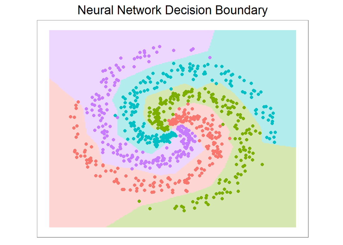
MNIST data and preprocessing
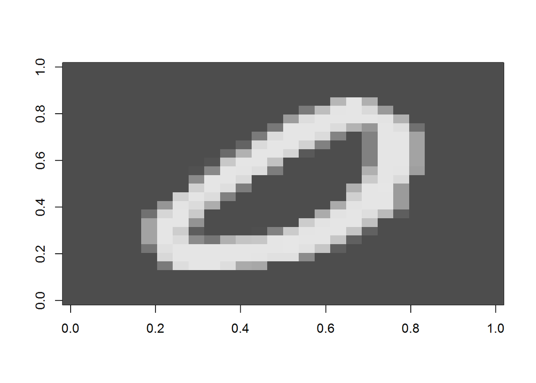
The famous MNIST (“Modified National Institute of Standards and Technology”) dataset is a classic within the Machine Learning community that has been extensively studied. It is a collection of handwritten digits that are decomposed into a csv file, with each row representing one example, and the column values are grey scale from 0-255 of each pixel. First, let’s display an image.
Now, let’s preprocess the data by removing near zero variance columns and scaling by max(X). The data is also splitted into two for cross validation. Once again, we need to creat a Y matrix with dimension N by K. This time the non-zero index in each row is offset by 1: label 0 will have entry 1 at index 1, label 1 will have entry 1 at index 2, and so on. In the end, we need to convert it back. (Another way is put 0 at index 10 and no offset for the rest labels.)
nzv <- nearZeroVar(train) nzv.nolabel <- nzv-1 inTrain <- createDataPartition(y=train$label, p=0.7, list=F) training <- train[inTrain, ] CV <- train[-inTrain, ] X <- as.matrix(training[, -1]) # data matrix (each row = single example) N <- nrow(X) # number of examples y <- training[, 1] # class labels K <- length(unique(y)) # number of classes X.proc <- X[, -nzv.nolabel]/max(X) # scale D <- ncol(X.proc) # dimensionality Xcv <- as.matrix(CV[, -1]) # data matrix (each row = single example) ycv <- CV[, 1] # class labels Xcv.proc <- Xcv[, -nzv.nolabel]/max(X) # scale CV data Y <- matrix(0, N, K) for (i in 1:N){ Y[i, y[i]+1] <- 1 } Model training and CV accuracy
Now we can train the model with the training set. Note even after removing nzv columns, the data is still huge, so it may take a while for result to converge. Here I am only training the model for 3500 interations. You can vary the iterations, learning rate and regularization strength and plot the learning curve for optimal fitting.
nnet.mnist <- nnet(X.proc, Y, step_size = 0.3,
                   reg = 0.0001, niteration = 3500)
## [1] "iteration 0 : loss 2.30265553844748" ## [1] "iteration 1000 : loss 0.303718250939774" ## [1] "iteration 2000 : loss 0.271780096710725" ## [1] "iteration 3000 : loss 0.252415244824614" ## [1] "iteration 3500 : loss 0.250350279456443"
## [1] "training set accuracy: 0.93089140563888"
## [1] "CV accuracy: 0.912360085734699"
Prediction of a random image
Finally, let’s randomly select an image and predict the label.
## [1] "The predicted digit is: 3"
displayDigit(Xtest) 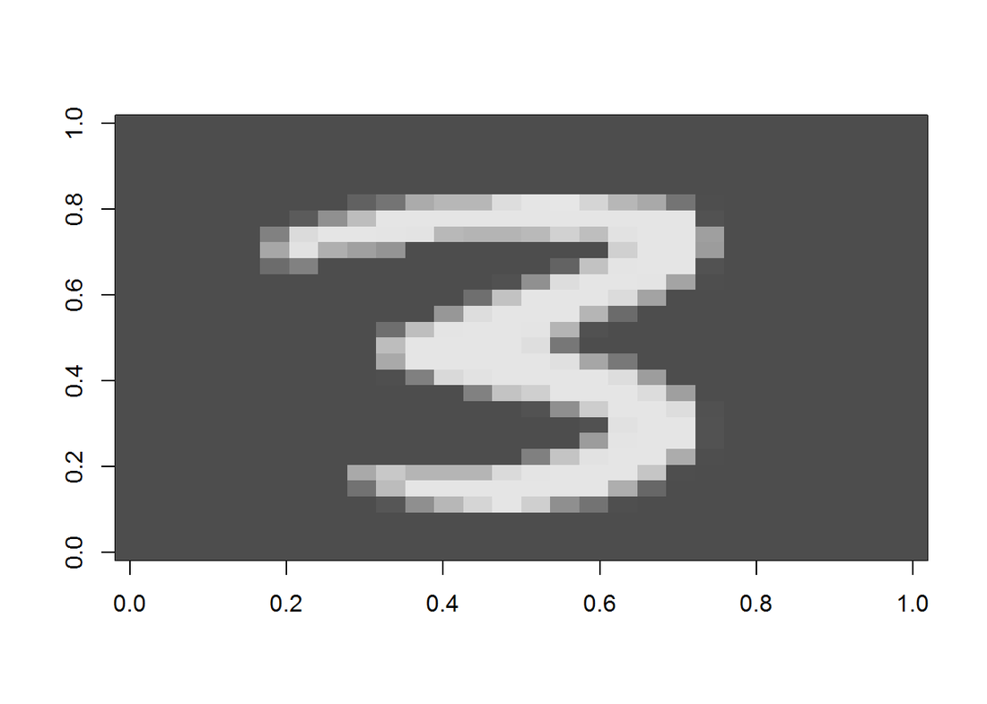
Conclusion
It is rare nowadays for us to write our own machine learning algorithm from ground up. There are tons of packages available and they most likey outperform this one. However, by doing so, I really gained a deep understanding how neural network works. And at the end of the day, seeing your own model produces a pretty good accuracy is a huge satisfaction.
|
AuthorA mechanical engineer who also loves data. Archives
January 2018
CategoriesBlogs I enjoy reading |


 RSS Feed
